Dark Patterns that I hate the most
Firstly I’d like to apologize for being so salty on thi blog lately. Since I deleted my Twitter account earlier on this year, I miss to spread my salt around so I’m using this blog now, however, I’m hoping this is not only my personal opinion but also a place to share ideas with people.
Having said that, I want to start by defining what a Dark Pattern is:
According to The Verge, they are interfaces designed to trick you. In words of Harry Brignull, they are like a Roach Motel: » The design makes it very easy for you to get into a certain situation, but then makes it hard for you to get out of it (e.g. a subscription). Harry is also the founder of Dark Patterns which is dedicated to “naming and shaming websites that use deceptive user interfaces”.
Also, darkpatterns.org identifies several types of dark patterns:
So basically he has documented a lot of categories with real examples that make use of the actual UX theory and some of the color psychology with the only goal of trick you into doing things that benefit their business instead of the users.
They also have a Twitter timeline where they document what they call the hall of shame. And their full list of the new hall of shame.
So that website actually inspired me to make my small effort to document:
The Dark Pattenrs that I hate the most
I actually hate every dark pattern I’ve seen documented by darkpatterns.org, however, I’d like to make my own hall of shame which make my life more miserable every time I see them.
The unsubscribe mailing list nightmare
Mailing lists are one of the first internet applications that we started using when the internet begin being something more accessible for most people, however, they cna become an actual nightmare if developers or people behind them try to make you harder to unsubscribe you from their lists, yes i’m looking at you Adidas, let’s see how this is going; so I signed up a long time ago to runtastic, this app for runners hoping to have a good tool for tracking my running mornings, however, I actually never used it and after I think 10 years or so, I got an email from them and once I realize I don’t want more emails from them, then when I click the unsubscribe button that according to a good UX design shouldn’t require any additional action from your side in order to unsubscribe you, look at what we have:
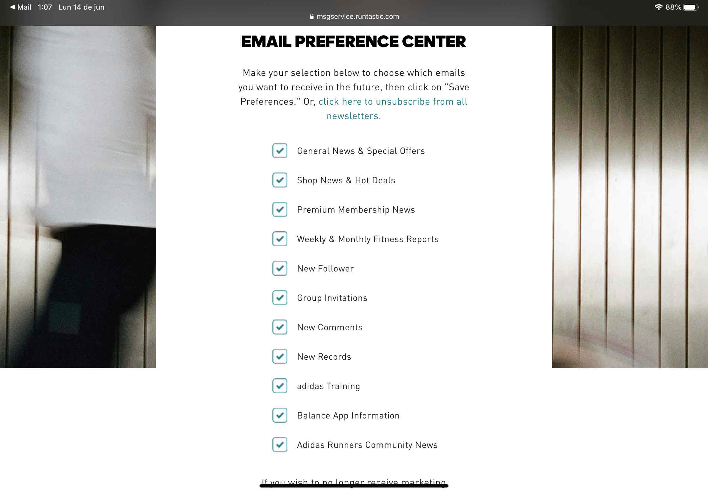
A damn list with ELEVEN checkboxes that you need to unmark manually to successfully unsubcribe from all emails. This is ridiculous, I mean firstly, why are part of a mailing list some actions that actually happen inside the application like new comments and others, those should be managed inside the application and not as a mailing list, but someone really brilliant working at Adidas said why not we manage all emails as mailing lists instead of personal configurations inside the app and why not we just subscribe the user to all of them and later on the user should manually unsubscribe from each one. Awful.
Let’s explore another example. I recently had to open a checks account with HSBC in order to get paid from one of my jobs and I mean, that’s ok, I understand you need some data from my side if I want to get some eventual advertisement, but I mean EVENTUAL, and also users should be able to opt int if they wish to, otherwise you shouldn’t be subscribing them to all you mailing shit. But hold on, once I decided to unsubscribe look at why they have as an option to do it:

If you’re reading this and don’t understand that spanish, let me translate it for you:
“If you’re not the user or if you wish to be deleted from our mailing list, just answer this email with the word UNSUBSCRIBE as the subject of the email.”
That’s absolutelly ridiculous, most of this mailing lists have no-reply like emails so you can avoid spammers, but guess what? They live like in the stone age and they want some spammy, I hope that email reaches a lot of spammers ¬¬
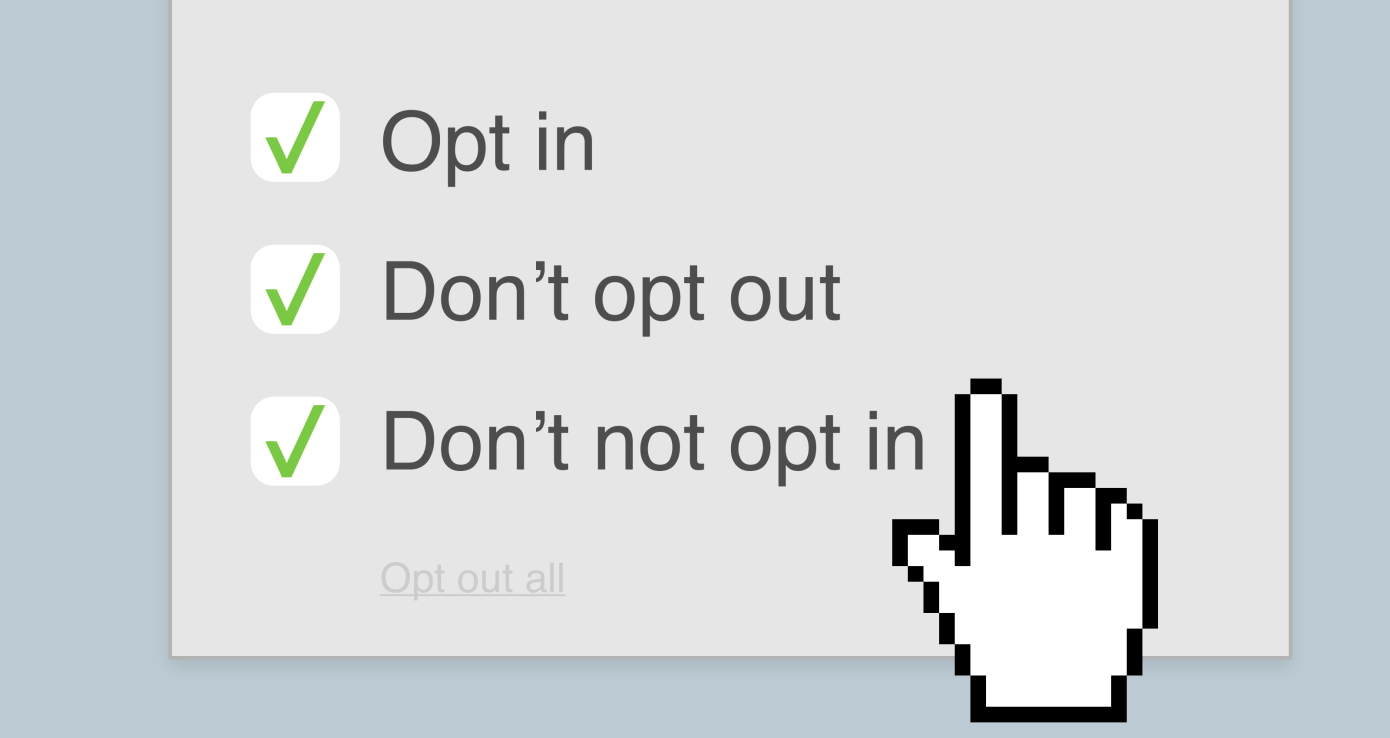
The cookies settings seven circles of hell
Once GDPR began a thing, several websites started adding lightning boxes for managing the cookies setting for their websites, and that’s fair since you do want to know if their using some kind of targeted advertising and maybe some of their ads partners or tools are using cookies to track you and you should be noticed on that and not only that but you must be able to choose not to be tracked, this is not being done across all websites, but on some of the European Union ones and those that are handling data from european customers. Ok, everything seems good to me until here, but as a digital activist and someone supporting the EFF I simply don’t like to click on Next>Next>Continue>Yes>Accept auto defaults, so always I got presented some of this cookie boxes I tend to opt out from all available options, this usually show you that there are some ‘Always active’ cookies, but here we go, there are some website that simply don’t get it:
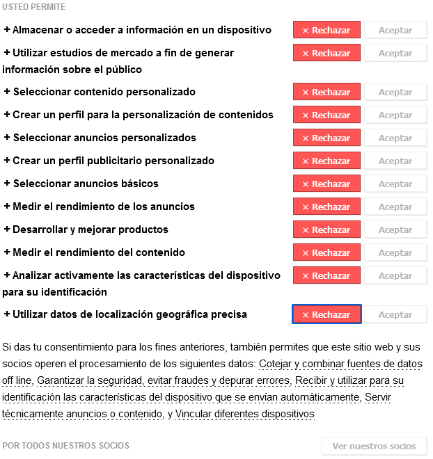
And you need to manually opt-out from every single option they provide unless you want them all activated, isn’t that a PITA? Why you just don’t add a single button to reject all and accept all and optionally the users can manually select those they’re interested in, but guess what? nobody wants to accept your stupid cookies, that’s why you use this UX tricks to track more data from users, and that’s shamefull.
The smallest YouTube link in the world
And finally, one that I want to specially mention since big companies are really lovers of Dark Patterns:
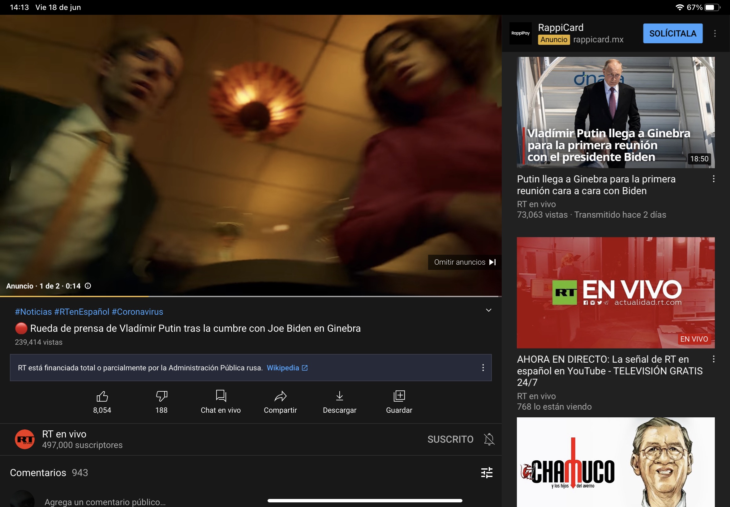
Really YouTube? The skip add link that I got when using my iPad is the smallest one that I can see on your webpage. But hold on, this is also a special one, I’ve noticed that if you don’t skip the first one you get another ad, isn’t that tricky? And the cherry of the pie is that sometimes if you don’t manually skip the ad you get stucked in there, I’ve noticed that because I play some youtube programs to wash the dishes and sometimes is relaly annoying when I have the hands wet. Also this might be a little bit of guessing, but also YouTube started using some algorithms to spot some of the climax moments of the video and they inject their advertisements there, same on you YouTube, I understand you want to be the monopoly of online advertising but that’s just awful.
Anyways, I just wanted to share those with you, if you reached until here then maybe you want to add some comment below, I really appreciate you being here. Thanks!